- https://travio.themeupstudio.com/
- https://tmb.my/travio-gr
- https://tmb.my/travio-gr
- FIRST-CUSTOMER-TODAY~10% Discount for the first customer of the day
- https://go.themeupstudio.com/travio-docs
- https://go.themeupstudio.com/travio-docs
- https://www.themeupstudio.com/contact/
Travio Ghost Theme Review for Travel Magazines and Blogs
I think Travio gets something very important right from the start: it does not feel like a generic blog theme wearing travel colors. It feels like a theme built around discovery, browsing, and visual exploration, which is exactly what I want from a travel-focused Ghost design.
I would put this in front of readers who want to publish a magazine-style travel site, a personal travel blog with strong categorization, or a content-led publication that needs more than a simple reverse-chronological homepage. I recommend it, and I think that recommendation feels earned here.
Quick verdict
I recommend Travio, and I am comfortable giving it a rating of 5. I also see it landing in the good range for value for money, feature set, and Ghost compatibility, which lines up with the overall impression the theme leaves as a complete publishing product.
What pushes it over the line for me is that it is not just attractive. It is structured. The homepage, archive flow, author views, tag views, member pages, and article pages all point to a theme that has been designed for real content browsing rather than surface-level polish.
Theme overview
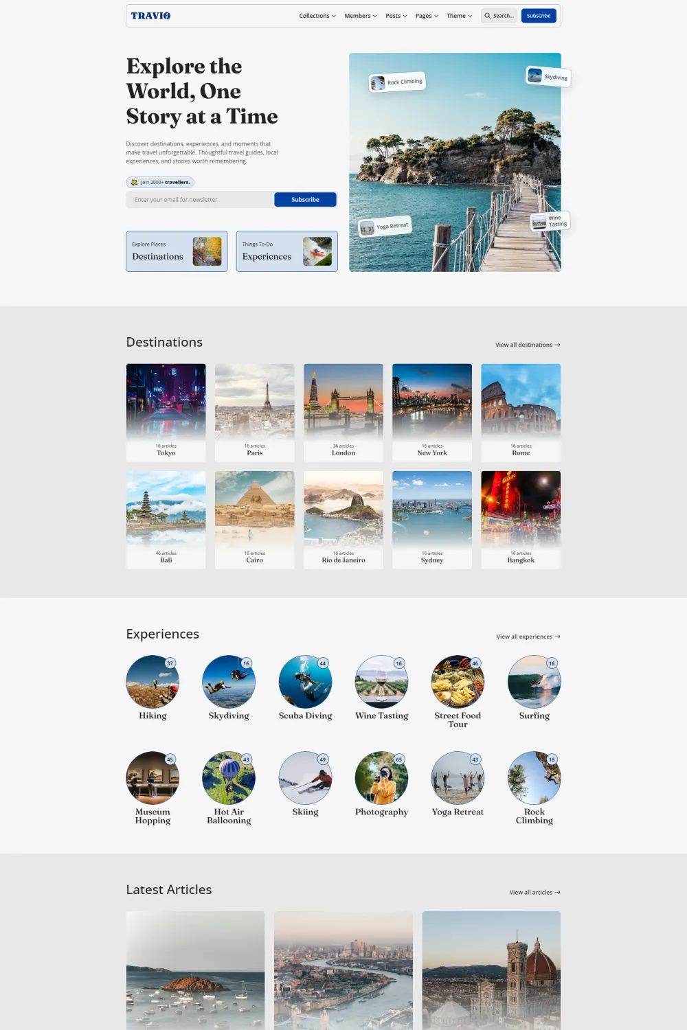
I see Travio as a creative Ghost theme from Theme Up Studio that leans into magazine and blog publishing with a travel-first lens. On the live demo, I immediately see a strong browse-led structure built around destinations, experiences, latest articles, and topic collections, which gives the whole theme a clear editorial direction instead of a vague one-size-fits-all identity.
I also like that the theme’s design direction is visibly energetic without becoming chaotic. It uses travel imagery, category-led navigation, large section breaks, and card-based content blocks to create momentum. That makes the site feel more like an editorial travel publication than a standard blog feed.
Ghost compatibility is listed as good, which is a positive signal for buyers who want a theme that fits comfortably into the Ghost ecosystem without turning compatibility into a question mark.
Who this theme is best for
I think Travio fits best for these readers:
- I would recommend it to magazine publishers who want a homepage with sections, content buckets, and strong browse paths instead of a plain post list.
- I would recommend it to blog owners who want their site to feel bigger than a personal journal, especially if they plan to organize content by themes, tags, places, or experiences.
- I would recommend it to travel creators who want destinations and experiences to act as entry points for discovery, not just labels hidden under posts.
- I would recommend it to publishers planning memberships, because the visible sign in, sign up, and subscribe paths make that part of the experience feel intentional rather than bolted on.
I would be less likely to point minimal writers or ultra-simple newsletter publishers toward Travio. This theme has a broader visual and structural ambition, so it makes the most sense when I actually want categories, archives, and discovery to do real work.
Design and user experience
I like the homepage because it gives readers multiple ways to enter the site immediately. I can search, browse destinations, browse experiences, subscribe, or jump into account-related pages without friction. That is smart UX for a content-heavy publication because it respects different reader intents from the first screen.
I also think the visual hierarchy is strong. The hero headline is clear, the two primary browse actions are obvious, and the sections below it move in a sensible order: destinations, experiences, latest articles, then deeper editorial groupings. I never get the feeling that the homepage is just stacking widgets for the sake of it.
The design has personality too. It is colorful, creative, and clearly meant to stand out. At the same time, it still keeps content cards readable by using familiar grid structures, short metadata blocks, and section labels that make scanning easy. I think that balance matters because standout design is only useful when it still supports reading.
I also like how the browse flow continues beyond the homepage. The live Articles page shows a full archive-style experience with filters and high content volume, while author and tag views extend that same structure deeper into the site. That gives the theme a stronger publishing backbone than homepage-only themes that look good in demos but thin out once readers click around.
On article pages, I can see related posts, comments prompts, and social sharing options, which helps keep readers moving instead of hitting a dead end after one post. That is exactly the kind of retention-oriented design choice I like seeing in a magazine or blog theme.
I also notice a visible color theme toggle, which supports dark mode. For a travel theme with strong imagery and a more expressive look, that is a practical feature rather than a decorative one.
Feature analysis
What I like most about Travio’s feature set is that it feels coherent. The features are not pulling in different directions. They all support publishing, browsing, membership, and content discovery.
I can already verify the broader archive behavior from the live demo through the Articles view, author pages, tag pages, and the visible filtering structure. For me, that matters because archive depth is one of the biggest differences between a theme that looks good on day one and a theme that still works once I have dozens or hundreds of posts published.
I also like that the member journey is visibly covered. The theme includes dedicated sign in, sign up, and subscribe pages, and that makes the membership layer feel like a proper part of the site architecture. If I am running premium content, newsletters, or subscriber-only features, that is a real advantage.
Beyond that, I see a feature set that gives publishers room to shape the site around their model. Travio includes an Archive Page, Authors Archive, Tags Archive, Sign In Page, Sign Up Page, Subscribe Page, Contact Form, Custom Error Page, Pricing Table, Carousel Slider, Dark Mode, Dropdown Menu, Horizontal Menu, Grid Layout, Filtering, Multiple Layouts, Video support, Related Posts, and Social Media Sharing. I think that combination makes it useful for both editorial magazines and more creator-led blogs that want richer structure without losing personality.
The grid layout and filtering features matter because they make large content libraries easier to explore. The related posts and social sharing matter because they help extend reader sessions. The pricing table matters for publishers thinking about paid tiers. The contact form and custom error page matter because they round out the site and make it feel finished, not partial.
I also think the multiple layouts and carousel slider are valuable in a practical sense. They give me more editorial flexibility when I want to spotlight featured content, vary page rhythm, or avoid making every section feel visually identical. For a magazine-style site, that kind of flexibility goes a long way.
Performance, SEO, and accessibility
I like what I see here. Travio is listed with a Google Accessibility score of 100%, Google Best Practices score of 100%, and Google SEO score of 100%. On top of that, the Accessibility Checker score is 95%, which I consider a strong result, not just an acceptable one.
That matters to me because expressive themes often lose discipline once performance and accessibility enter the conversation. Travio’s reported scores suggest that the theme is not relying on visual flair alone. It is pairing design ambition with solid technical discipline in the areas that buyers should care about.
I would especially highlight the 95% Accessibility Checker result as a real positive. Anything above 90% is good, and 95% is strong. So from my perspective, accessibility is not an area of concern here. It is one of the reasons the theme becomes easier to recommend with confidence.
Pros and cons
Pros
- I like that Travio has a clear niche identity and does not feel like a generic blog theme with travel photos added later.
- I like that the homepage is built around discovery through destinations, experiences, latest stories, and themed sections.
- I like that the archive structure goes deeper through article listings, author views, tag pages, and filtering.
- I like that membership paths are already present through sign in, sign up, and subscribe pages.
- I like that the official scores for accessibility, SEO, and best practices are excellent.
- I like that the feature set covers both visual flexibility and practical publishing needs, including dark mode, related posts, social sharing, video, pricing, and multiple layouts.
Cons
- I think the design is intentionally bold and content-rich, so it will suit readers who want a stronger editorial look more than readers chasing ultra-minimal simplicity.
- I think the taxonomy-led structure works best when I have enough categories, themes, destinations, or experiences to make that browse model worthwhile.
Rating and recommendation
I am keeping my rating at 5, and my recommendation is yes. For me, that rating makes sense because Travio combines a strong niche direction, good value for money, a good feature set, good Ghost compatibility, and a live demo structure that feels genuinely useful for real publishing.
I do not rate themes highly just because they look polished in screenshots. I rate them highly when I can see a believable publishing system underneath the design. With Travio, I can see that system.
Final thoughts
I would confidently recommend Travio to anyone building a travel magazine or a travel blog on Ghost who wants more structure, more visual energy, and more room to organize content in a reader-friendly way. It looks distinctive, but it also feels thought through.
What sells it for me is the combination of standout design and practical publishing depth. I get archive coverage, membership pages, filtering, related posts, social sharing, dark mode, and a layout system that feels built for discovery. When I add the strong reported accessibility and SEO results on top, I have very little hesitation recommending it.
If I were choosing a Ghost theme for a travel-focused publication today, Travio would absolutely be on my shortlist, and for the right magazine or blog site, I would not just shortlist it. I would pick it.