- https://taba.aspirethemes.com/
- https://tmb.my/taba-xx
- https://tmb.my/taba-xx
- TODAY~10% Off.
- https://aspirethemes.com/bundle
- https://www.notion.so/30eb78f638d881608ddec173236d6cc9
- https://aspirethemes.com/contact
Taba Ghost Theme Review: A News Layout That Misses the Mark
I spend a lot of my time digging through the Ghost theme ecosystem to find gems that help creators stand out. Every now and then, I come across a theme that looks fine on the surface but fails to deliver the depth or value I expect for a professional site.
Taba is a theme built for news-style publications, but after a close look, I find it hard to get excited about. It feels like a basic offering in a market that is currently filled with much more innovative and feature-rich alternatives.
Quick verdict
I do not recommend Taba for most Ghost users. It feels like an underwhelming package that doesn't provide enough functionality or design flair to justify the investment.
My Rating: 1 / 5
Theme overview
Taba is developed by Aspire Themes and is positioned as a clean, minimal solution for digital newsrooms. While the developer has a history in the Ghost space and the theme maintains good compatibility with the platform, the overall direction feels dated.
The design is centered around a very traditional layout that doesn't take many risks. While stability is important, I look for a bit more personality and modern utility in a premium theme, and I just don't see that here.
Who this theme is best for
This theme is built specifically for the news niche. If you are running a site that publishes multiple times a day and needs to surface a high volume of headlines, the layout is technically designed for that purpose.
However, even within the news category, there are better ways to organize content. The use case here is very narrow, and even then, I think most news organizations would find the lack of advanced editorial features limiting.
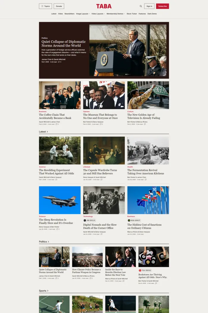
Design and user experience
The design of Taba relies on a standard grid layout that feels functional but ultimately quite plain. When I look at the demo, the visual hierarchy is clear enough, but it lacks the sophisticated "editorial" feel that high-end news sites usually strive for.
The navigation is handled through a horizontal menu with support for dropdowns. While this works for basic site structures, the browsing flow feels a bit static.
The theme is mobile-friendly, which is a baseline requirement today. However, the mobile experience doesn't offer anything special in terms of touch-optimized navigation or unique mobile UI elements.
Feature analysis
The feature set in Taba is one of its weakest points. It includes the absolute basics, such as a custom error page and social media sharing buttons, which should be standard in almost any theme.
The grid layout is the primary way stories are presented. While this helps with content density, it doesn't offer much in the way of visual variety or unique "sections" to highlight featured news.
You do get related posts at the bottom of article pages. This is a helpful feature for keeping readers on your site longer, but it’s a very common inclusion that doesn't set this theme apart from free alternatives.
Performance, SEO, and accessibility
On the technical side, the theme is solid but has some notable flaws. It earns perfect 100% scores for Google’s SEO and Best Practices categories, which is great to see.
However, the accessibility story is a bit more complicated. While Google gives it a high 96% for accessibility, more detailed testing via Accessibility Checker results in a score of 89%.
A score in the 80s indicates room for improvement. For a modern publication, I’d prefer to see a theme that hits the mid-to-high 90s across all accessibility testing platforms to ensure all readers can enjoy the content without barriers.
Pros and cons
Pros
High SEO and Best Practices scores; Simple, easy-to-understand navigation.
Cons
Very limited feature set; Poor value for money; Design feels uninspired and out dated. Seems like a quick way to make money by adding a new skin on Tripoli theme.
Rating and recommendation
I am giving Taba a rating of 1. In my opinion, this theme represents bad value for money because the feature set is so thin compared to what else is available for Ghost.
It is rare that I suggest skipping a theme entirely, but in this case, I think your budget is better spent elsewhere. The lack of modern editorial tools and the "just okay" accessibility score make it a hard sell.
Final thoughts
If you are looking for a powerful, modern news theme for Ghost, Taba likely isn't it. It covers the basics, but in the competitive world of digital publishing, "basic" usually isn't enough to help you grow.
I strongly advise you to keep looking for a theme that offers more robust features and a more engaging design. There are many other developers producing stellar Ghost themes that provide much more value for your investment.