- https://scope.priority.vision/
- https://tmb.my/scope-ls
- https://tmb.my/scope-ls
- https://store.priority.vision/buy/e4becf58-8df3-403d-8805-da05dbd47b5d/?aff=1jB1m
- https://www.priority.vision/docs/scope/introduction/
- https://www.priority.vision/docs/scope/changelog/
- https://www.priority.vision/contact/#support
Scope Ghost Theme Review for Modern Magazine Publishers
I see Scope as one of those Ghost themes that immediately makes an impression with structure more than spectacle.
It feels clean, deliberate, and visually organized, which is often what I want from a magazine-oriented design. At the same time, I do not see it as a theme I would recommend to everyone by default. I think it makes the most sense for publishers who specifically like a minimal editorial style with sidebar-led browsing and multiple homepage presentation options.
Quick verdict
My verdict on Scope is situational.
I do not see it as a must-buy Ghost theme for every magazine site, but I do think it can work well for the right publication. My rating here is 3, and that fits the overall experience: good in some important areas, but not strong enough across the board for me to give it a broader recommendation.
Theme overview
From the official positioning, Scope is presented as a clean Ghost theme with sidebar navigation and custom landing pages. The documentation also frames it as a minimal theme for creative professionals with spacious design and a typography-first approach. That combination gives me the impression of a theme built for editorial publishing with a strong visual point of view, especially for magazine-style content that benefits from curated sections and guided browsing.
The developer behind the theme is Priority Vision, and the overall design direction looks modern, restrained, and content-focused rather than flashy. I also see enough in the official materials to say that the theme is built with a fairly mature feature surface, while the provided compatibility rating places Ghost compatibility in the good range rather than positioning it as a standout strength.
Who this theme is best for
I think Scope fits best for readers of my site who want a magazine-style Ghost theme with a more curated and design-led personality.
It makes the most sense for:
- Small to mid-sized digital magazines that want a polished editorial feel
- Design, culture, media, and niche publishing sites that care about presentation
- Content-heavy blogs that want tags, authors, and category-style browsing to be part of the experience
- Publishers who like switching between different homepage styles instead of being locked into one layout
I would be less enthusiastic about it for buyers who want a plain, utility-first blog theme with minimal visual personality. I would also not put it near the top of my list for anyone who is prioritizing accessibility above everything else, because the measured accessibility picture here is simply not strong enough for that use case.
Design and user experience
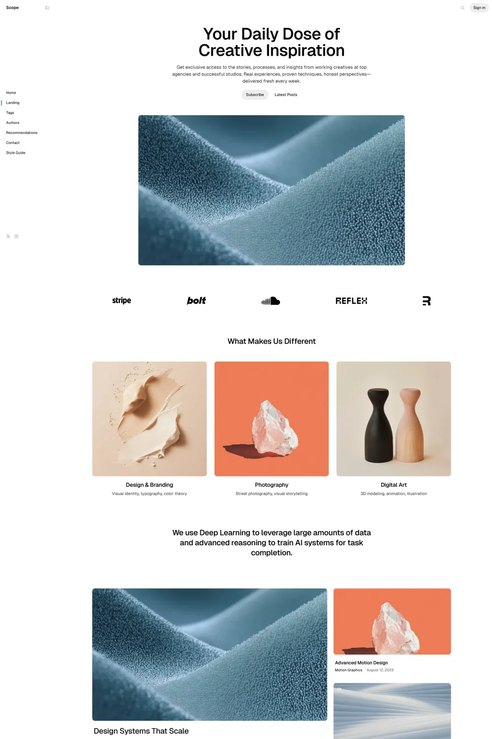
What I like most about Scope is that the browsing structure feels intentional. The live demo shows multiple homepage variants, including Classic, Slider, Carousel, and Grid Horizontal, along with dedicated navigation to Landing, Tags, Authors, Recommendations, Contact, and Style Guide pages. That tells me the theme is designed around exploration, not just linear reading.
Visually, I find the layout calm and readable. The spacing is generous, the typography gets room to breathe, and the overall hierarchy feels easy to scan. It does not overload the page with decorative noise, which is a good fit for magazine content that needs to balance featured stories, category browsing, and recurring content sections.
I also think the sidebar and vertical-navigation flavor give Scope a more distinctive identity than many generic Ghost magazine themes. That said, this is also where the theme becomes a matter of taste. Some buyers will love that guided, structured feel. Others may find it a bit too opinionated if they prefer a more conventional top-nav publication layout.
From the demo structure, the theme also appears mobile-aware in spirit because the layout system is clearly built around stacked content blocks, cards, and modular sections. I can comfortably say the browsing flow looks modern and responsive in concept, even if my main takeaway is still about content hierarchy rather than visual novelty.
Feature analysis
For me, the value of Scope is less about one headline feature and more about the collection working together.
The theme includes a solid editorial feature set built around magazine publishing needs, including Authors Archive, Tags Archive, Contact Form, Custom Error Page, Carousel Slider, Dark Mode, Dropdown Menu, Vertical Menu, Grid Layout, Multiple Layouts, Code Block, Social Media Sharing, and Related Posts. On top of that, the official documentation clearly shows support areas such as social sharing, dark and light mode controls, tags, authors and contact pages, code syntax highlight, table of contents, image lightbox, and landing-page related sections.
Here is why that matters in practice:
- Authors Archive and Tags Archive help magazine sites feel organized instead of flat. I always look for these when a publication has multiple writers or topic clusters.
- Carousel Slider, Grid Layout, and Multiple Layouts give publishers more freedom to shape the homepage around their content strategy.
- Vertical Menu and Dropdown Menu support deeper navigation, which is useful when a site has enough sections to justify more guided browsing.
- Dark Mode is a meaningful comfort feature, especially for readers who spend time with long-form content.
- Code Block support is useful for technical or educational magazines that publish tutorials.
- Social Media Sharing and Related Posts matter because they improve content discovery and can help extend session depth.
- Contact Form and Custom Error Page are not glamorous features, but they make the site feel more complete and professional.
I also like that the live demo and official materials suggest Scope is not locked into a single homepage personality. That flexibility is important because magazine publishers often change priorities over time, especially when featured content, recency, and category-led browsing need to be balanced differently.
Performance, SEO, and accessibility
This is where my neutral stance becomes easiest to explain.
On the positive side, the supplied measured scores show Google Best Practices at 100% and Google SEO at 92%, which I consider strong. Those numbers suggest the theme is doing several important things right from a technical and search-readiness perspective. The provided Google Accessibility score of 82% is more mixed. I would not call that poor, but I also would not call it a strength. It suggests some room for improvement rather than excellence.
The bigger issue for me is the separate Accessibility Checker score of 35%. That is not a small gap. That is a clear weakness, and I think buyers should take it seriously. When one accessibility measure lands that low, I cannot treat accessibility as a minor footnote in the review. It becomes one of the central reasons I see Scope as situational rather than broadly recommendable.
So my overall read is this: Scope looks solid on best practices and reasonably good on SEO, but accessibility is the area that most clearly holds it back. For some buyers, that will be manageable. For others, especially publishers who care deeply about accessibility quality, it will be a major reason to keep looking.
Pros and cons
Pros
- Clean, modern editorial design with a strong sense of structure
- Multiple homepage styles, including slider, carousel, and grid-based presentation
- Useful magazine-oriented page types like tags, authors, and contact pages
- Strong supporting technical scores for best practices and SEO
- Good value and a generally good feature set based on the supplied evaluation
Cons
- Accessibility is a real concern, especially with the very low Accessibility Checker result
- The layout style feels opinionated, so it will not match every magazine brand equally well
- My overall experience lands in the good-not-great range rather than feeling exceptional across the board
Rating and recommendation
My rating for Scope is 3.
That score makes sense to me because I can see the appeal. I like the structured editorial design, I like the multiple layout directions, and I think the overall feature set is good. I also think the value for money looks good in a narrow, use-case-specific sense. But I cannot move beyond a NEUTRAL recommendation because the accessibility weakness is too significant for me to ignore, and the design approach feels best suited to a narrower buyer profile rather than the broader Ghost market.
Final thoughts
I would describe Scope as a theme with a clear identity and a clear audience.
If I were choosing it, I would be doing so because I specifically wanted a clean magazine theme with sidebar-led browsing, multiple homepage layouts, and a modern editorial feel. I would not be choosing it because it is the safest all-around option on the market. That is the key distinction for me.
So my final take is simple: I see Scope as a situational pick. If your publication style matches its design direction and you are comfortable with the accessibility tradeoff, it can still be a worthwhile option. If accessibility is high on your priority list or you want a more universally adaptable magazine theme, I would keep looking.