- https://keel.kusa-projects.com/
- https://tmb.my/keel-ls
- https://tmb.my/keel-ls
- https://www.kusa-projects.com/keel-documentation
- https://keel.kusa-projects.com/changelog/
- https://www.kusa-projects.com/contact
Keel Ghost Theme Review for Creative Magazine Sites
When I look at Keel, the first thing I notice is that it does not behave like a safe, generic Ghost theme. It has a clear editorial personality, and that immediately gives it more presence than many magazine themes that rely on the same familiar grid and little else.
For readers who want a magazine-style Ghost site with a more creative edge, I think Keel is a very strong option. It feels built for publishers who care about presentation, browsing flow, and visual identity just as much as they care about publishing articles consistently.
Quick verdict
I recommend Keel, and my rating is 5. It gives me the combination I want in this category: a distinctive front-end style, a deep set of layout controls, and a broad range of built-in page types that make the theme feel complete rather than barebones.
Theme overview
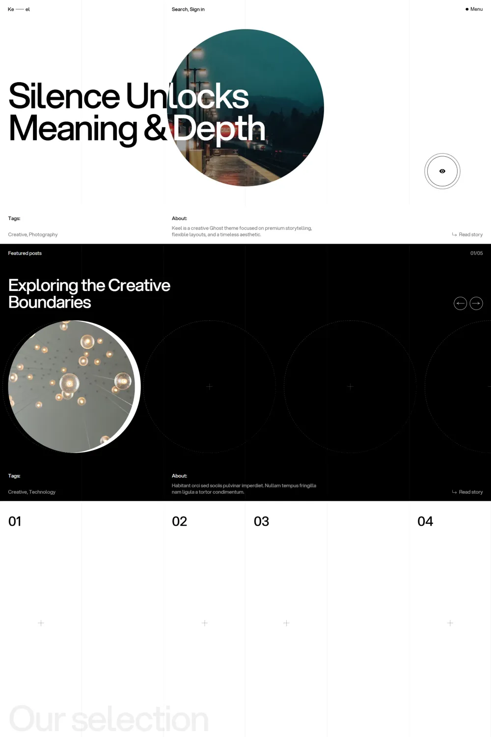
Keel is developed by KUSA Projects, and its own positioning is clear: this is a creative Ghost theme focused on premium storytelling, flexible layouts, and a timeless aesthetic. That direction comes through clearly in the demo, which leans into strong typography, expressive image presentation, layered navigation, and a homepage structure designed to feel curated instead of purely chronological.
What I like here is that the theme’s design ambition is backed by real structural flexibility. Keel is not just one homepage and one post template dressed up with stylish mock content. It includes multiple homepage hero types, multiple slider styles, several card styles, several author page layouts, custom membership-related pages, archive-style pages, and post layout variations that give it much more range than its polished exterior might initially suggest.
Ghost compatibility is marked as good, which fits the overall impression Keel gives. It feels like a theme intended for actual publishing workflows, not just a visual concept.
Who this theme is best for
I see Keel working best for magazine publishers who want their site to feel designed, not merely assembled. If your publication covers culture, design, photography, trends, commentary, lifestyle, or any other visually led editorial niche, this theme makes a lot of sense.
I also think it fits creators and editorial teams who want flexibility without giving up a strong identity. Keel lets you shape the homepage and card presentation in several ways, so you can keep the core creative feel while still steering the site closer to your own brand.
For a straightforward, minimal, purely utility-first publication, I would probably lean toward something calmer. Keel is best when you actually want the design to participate in the reading experience.
Design and user experience
From a design perspective, Keel does a very good job of creating hierarchy. The homepage leads with a strong hero area, then follows it with a featured slider, discovery-focused sections, a secondary slider area, and a latest-posts feed. That sequence gives the front page a more editorial rhythm than a basic magazine grid.
I also like how the theme uses numbered sections, bold headings, large imagery, and varied card treatments to keep browsing from feeling flat. There is a clear attempt here to make the act of scanning the homepage feel engaging. For readers, that matters because it encourages exploration instead of pushing everything into one repetitive list.
Navigation is another strong point for me. The compact header actions, the menu trigger, the nested navigation structure, the search entry point, and the sign-in access are all visible early in the experience. That gives the theme a polished publishing feel and helps it look ready for both open-access content and member-based content.
On individual posts, Keel keeps the reading view visually strong without making it confusing. Titles, supporting intro text, metadata, the feature image, social sharing, and previous/next navigation are all present in a way that feels familiar but still aligned with the theme’s creative direction.
I also see clear mobile-aware signals in the demo. The presence of a hamburger-style menu, condensed top-level actions, modular card layouts, and swipeable or slider-led sections all suggest a design that is thinking beyond large desktop screens. Even without turning this into a mobile test, the UI choices point in the right direction.
Feature analysis
What makes Keel more compelling to me is that its feature set is not random. Most of the included features support real publishing needs.
The archive-style coverage is especially good. Keel includes an archive page, a tags archive, an authors archive, and an all-posts page that groups posts by year and loads them in paginated batches through infinite scroll. For content-heavy magazine sites, that is genuinely useful because discovery matters a lot once the homepage can no longer carry the entire site alone.
Membership-related coverage is also broad. I can verify custom sign-in, sign-up, subscribe, account, and membership pages, which gives publishers more control over the member journey than a theme that relies only on default popups. For anyone building a Ghost site with reader accounts or paid tiers in mind, that is a meaningful advantage.
Layout flexibility is one of Keel’s biggest strengths. I can verify two homepage hero styles, two slider styles, three homepage secondary slider choices, five card types, three author page layouts, multiple menu and footer styles, post card info controls, image aspect ratio controls, page animations, smooth scrolling, and the ability to pin a specific hero post. That gives publishers a lot of room to tune the site without losing the theme’s identity.
I also like that the theme includes built-in social sharing on posts, visible contact and social integrations, and a custom 404 page in the navigation structure. Those details are easy to overlook, but together they help the theme feel more complete.
Keel’s creative side is not just cosmetic either. The combination of standout card styles, expressive homepage sections, multiple layouts, and dark-mode support gives it a stronger editorial personality than many publication themes that stop at a hero banner and a tag list. For the right brand, that can be the difference between a site that looks memorable and one that looks replaceable.
Performance, SEO, and accessibility
On the technical side, Keel makes a very good first impression. The supplied Google scores are strong, with 96% for Accessibility, 96% for Best Practices, and 100% for SEO. Those are the kind of numbers I like seeing because they suggest the theme is not sacrificing technical quality just to chase visual flair.
That said, I would not ignore the separate Accessibility Checker result of 71%. For me, that is the most important caution around this theme. A score below 80% is not something I would brush aside, and it tells me there is a real accessibility weakness that still needs improvement even if the Google-side scores look excellent.
So my view is balanced here. Keel looks strong in SEO and overall technical presentation, but accessibility is not an outright win. If accessibility is a top priority for your publication, this is the area I would scrutinize most closely.
Pros and cons
Pros
- I think the design has real personality and does not blend into the usual magazine-theme crowd.
- I can verify a very flexible layout system with multiple hero, slider, card, author, menu, and footer options.
- The archive coverage is strong, including archive, tags, authors, and all-posts browsing structures.
- The custom sign-in, sign-up, subscribe, account, and membership pages make it more capable for Ghost membership sites.
- The technical score profile is very strong for SEO and best practices.
- Social sharing and polished navigation details help the theme feel more complete in day-to-day publishing use.
Cons
- The 71% Accessibility Checker result is a genuine weakness and the biggest drawback I see here.
- I would not choose this for a publication that wants a very plain, neutral, or corporate visual tone. The design language is more expressive than that.
- Some of the visual styling, sliders, and decorative presentation choices may feel like more than necessary for buyers who prefer a quieter reading experience.
Rating and recommendation
My rating for Keel is 5, and yes, I recommend it.
The reason I rate it this highly is simple: I think it succeeds both as a design product and as a publishing product. It looks distinctive, it offers real layout flexibility, it covers important archive and membership pages well, and it feels much more thought-through than themes that only focus on the homepage.
The accessibility weakness is the one area that stops this from feeling flawless to me. Even so, if I judge Keel as a magazine theme for Ghost buyers who want style, flexibility, and a more premium editorial presence, I still see it as one of the stronger options in that lane.
Final thoughts
I think Keel is a strong recommendation for anyone building a creative magazine site on Ghost. It has a clear point of view, and I always appreciate that when it is backed by real feature depth instead of surface-level polish.
What I like most is that it gives you room to shape the experience. You are not stuck with one homepage mood, one card style, or one way to present authors and archives. That flexibility makes the theme much more useful over time, especially for growing editorial sites.
If you want a magazine theme that feels creative, premium, and noticeably more distinctive than the average Ghost design, I would absolutely keep Keel on your shortlist. In my view, it earns that place.


