- https://ida.themex.studio/
- https://tmb.my/ida-ls
- https://tmb.my/ida-ls
- https://themex.lemonsqueezy.com/buy/add20d6c-e05a-4e3c-a954-8b093f4b704d/?aff=1jB1m
- https://themex.studio/docs/ida-docs/
- https://themex.studio/ida-changelog/
- https://themex.studio/contact/
Ida Ghost Theme Review: A Minimalist Powerhouse for Modern Magazines
Finding a theme that balances a high content volume with a clean aesthetic is often harder than it looks. Many magazine layouts feel cluttered the moment you add more than five posts, but Ida takes a different approach.
I’ve spent time diving into how this theme handles layouts, and it’s clear that it was designed for publishers who want their photography and headlines to do the heavy lifting. If you are running a digital magazine or a content-heavy blog, this might be exactly what you need.
Quick Verdict
I recommend Ida for users who prioritize a sleek, grid-based aesthetic and top-tier SEO performance. It isn't perfect, particularly regarding some deeper accessibility metrics, but for a modern publication, it’s a very strong contender.
My Rating: 4/5
Theme Overview
Ida is a premium Ghost theme developed by Themex Studio. It is built with a clear focus on the magazine use case, utilizing a sophisticated design direction that feels both high-end and functional.
One of the first things I look for in a theme is how well it plays with the core Ghost ecosystem. Ida shows good Ghost compatibility, ensuring that the latest features of the platform feel integrated rather than tacked on. The overall vibe is professional, airy, and very much in line with current editorial trends.
Who This Theme Is Best For
This theme is built specifically for the magazine format. If you are managing multiple contributors or publishing several times a week, the layout structures here will serve you well.
It is an ideal fit for lifestyle, tech, or culture magazines where visual storytelling is just as important as the prose. Because it handles multiple authors and categories so cleanly, it works best for those moving away from a simple "chronological blog" look toward a more structured media brand.
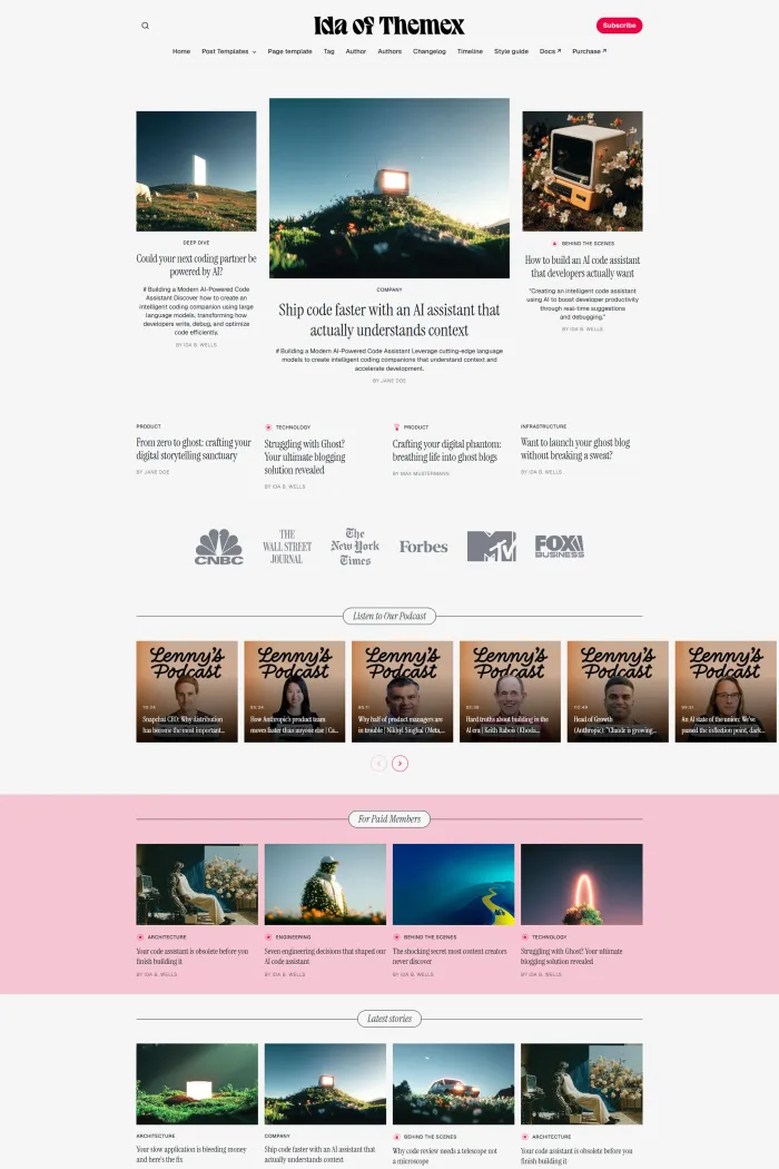
Design and User Experience
The design language of Ida is rooted in a sharp grid layout. From a UI perspective, it’s incredibly disciplined; the white space is intentional, and the visual hierarchy makes it very easy for a reader to distinguish between featured stories and secondary news.
The browsing flow feels natural. Whether you are on a desktop or a mobile device, the navigation remains intuitive thanks to a well-implemented horizontal menu and a clean dropdown system. The mobile responsiveness is a standout, maintaining the integrity of the grid without making the screen feel cramped.
Feature Analysis
Ida comes packed with several functional features that elevate the reading experience.
- Dark Mode: This is a must-have for modern readers. The transition is smooth and well-styled, ensuring that contrast remains high without being jarring.
- Table of Contents: For long-form editorial pieces, the built-in table of contents is a massive win for readability and user retention.
- Authors Archive: This is essential for any true magazine. It gives your contributors the spotlight they deserve and helps build authority with your audience.
- Multiple Layouts: You aren't stuck with just one look. The ability to toggle between different grid styles allows you to keep the homepage feeling fresh.
- Social Media Sharing: The integration is seamless, encouraging readers to distribute your content without bulky, third-party plugins slowing things down.
Performance, SEO, and Accessibility
When it comes to technical performance, Ida is an absolute speed demon. It scores a perfect 100% in Google’s SEO and Best Practices categories, which is a massive advantage for anyone looking to rank in search results.
However, there is a split story when it comes to inclusivity. While it hits a 96% Google Accessibility score, the more rigorous Accessibility Checker tool gives it a 65%. This indicates some underlying weaknesses that need improvement—specifically for users relying on screen readers or specific navigation aids. It’s a fast, search-friendly theme, but it has some homework to do on the accessibility front.
Pros and Cons
Pros
- Incredible SEO and Best Practices scores (100%).
- Clean, professional magazine grid that looks great on all devices.
- Native Dark Mode and Authors Archive features.
- Smooth navigation via horizontal and dropdown menus.
Cons
- Accessibility Checker score of 65% suggests a need for better inclusive design.
- The feature set is focused and effective, but may feel "medium" for those seeking heavy customization.
Rating and Recommendation
Rating: 4/5
I am giving Ida a 4-star rating because it excels in the areas that matter most for growth: speed and SEO. The value for money is good, and while the feature set isn't the largest on the market, every tool included is genuinely useful for a digital publisher.
If you can overlook the current accessibility gaps—or have the technical know-how to tweak them—this is a highly recommended theme for your next project.
Final Thoughts
If you want your Ghost site to look like a high-end digital publication right out of the box, Ida is a fantastic choice. It moves away from the "standard blog" look and gives you a professional magazine framework that is fast, beautiful, and built for the future of search.
For those prioritizing a modern grid aesthetic and top-tier performance, Ida is a winner. It’s a confident, stylish home for your content.