- https://enova.labs.enova.studio/
- https://tmb.my/enova-ls
- https://tmb.my/enova-ls
- Q1ODYYMQ~20% Off. Valid for 2 weeks after launch.
- https://docs.enova.studio/docs/enova
- https://docs.enova.studio/docs/enova/changelog
- https://ghost.org/experts/kasun-jayarathna/?via=tmg#contact
Enova Ghost Theme Review: A Grid Layout That Misses the Mark
Finding the right theme for a Ghost blog should be an exciting process, but it often leads to a lot of frustration. I have spent a significant amount of time looking at how themes handle content, and unfortunately, Enova is one that left me feeling underwhelmed.
It is marketed as a clean, grid-based solution for bloggers, but the more I looked at it, the more I realized it struggles to find its own identity. If you are looking for a reliable, inclusive home for your writing, you might want to read this before hitting the buy button.
Quick verdict
I do not recommend the Enova theme for most Ghost users. While it has some decent performance scores on paper, the actual experience of using and navigating it feels uninspired and technically lacking in key areas.
I have given this theme a rating of 2 out of 5. It is a situational choice at best, but for the average blogger, there are far better alternatives available in the Ghost ecosystem.
Theme overview
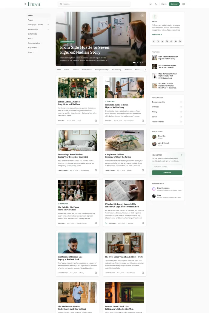
Enova is a theme developed by Enova that focuses almost entirely on a traditional blog structure. It uses a grid-based approach to show off your posts, aiming for a clean and minimalist aesthetic.
The design direction is clearly intended to be modern, using plenty of white space and a structured layout. It maintains good compatibility with Ghost, ensuring that the core features of the platform work as expected.
Who this theme is best for
This theme is designed specifically for bloggers. If you are running a personal journal or a simple niche site where you just want your latest articles displayed in a grid, this is the primary audience Enova is targeting.
Because it lacks advanced features for memberships or complex portfolios, it really only fits that narrow "standard blog" category. Even for that use case, I find it hard to suggest it over the more robust options currently on the market.
Design and user experience
When I look at the Enova demo, the first thing I notice is the vertical menu and the general layout hierarchy. It tries to be different by moving away from a standard horizontal header, but this choice feels more like a hindrance than a feature.
The grid layout is functional, but it lacks the visual flair needed to make a blog stand out. Navigation feels a bit clunky, and the browsing flow doesn't have that effortless "snap" that the best Ghost themes provide.
On mobile, the theme is functional, but the vertical menu elements can feel a bit crowded. The readability is decent, but the overall visual hierarchy doesn't do enough to guide a reader’s eye toward the most important content.
Feature analysis
Enova does include a few standard features that you would expect from a modern blog theme. The carousel slider is probably the most prominent visual element, allowing you to highlight featured posts at the top of your page.
It also includes a dark mode toggle, which is a nice touch for readers who prefer browsing in low-light environments. There is a vertical menu and a dropdown menu system intended to help organize your navigation links.
Beyond that, you get basics like social media sharing buttons, related posts sections to keep readers on the site, and a custom error page. While these features are useful, they are fairly standard across most Ghost themes today and don't offer much of a "wow" factor.
Performance, SEO, and accessibility
This is where the story gets a bit complicated. On the surface, the technical scores look great. Enova hits a 100% on Google’s Best Practices and a 92% for SEO, which shows the foundation is solid for search engines.
However, the accessibility story is a major red flag for me. While the Google Accessibility score shows a 95%, a deeper dive with the Accessibility Checker reveals a much lower score of 62%.
In my view, an accessibility score below 80% is a significant weakness. It suggests that many readers using assistive technologies may struggle to navigate your site, which is something I simply cannot overlook when recommending a theme.
Pros and cons
Pros
- Achieves a perfect score in Google Best Practices.
- Includes a built-in dark mode for better night-time reading.
- Simple grid layout that is easy to understand.
- Good SEO scores out of the box.
Cons
- Very poor Accessibility Checker score of 62%.
- The vertical menu can feel intrusive and less intuitive than horizontal options.
- Limited feature set that doesn't offer much beyond the basics.
- Lacks a unique design identity to help your brand stand out.
Rating and recommendation
I am giving Enova a rating of 4 out of 5. It is a functional theme, but it doesn't do anything exceptionally well, and its accessibility shortcomings are a real concern for any modern website owner.
My recommendation is to skip this one. When you are paying for a theme, you should expect a high level of inclusivity and a design that feels ahead of the curve, neither of which I feel Enova provides.
Final thoughts
At the end of the day, your theme is the face of your brand. Enova provides a basic grid for your words, but it does so with significant compromises in how accessible and engaging your site will be for all visitors.
If you are looking for a blog theme, I strongly advise you to keep looking. There are many other Ghost themes that offer better design, more features, and much higher accessibility standards for a similar investment.