- https://article.storiedthemes.com/
- https://tmb.my/article-ls
- https://tmb.my/article-ls
- https://storiedthemes.lemonsqueezy.com/buy/3b96fcdb-6314-439c-a4bf-7d5dab6adfc0/?aff=1jB1m
- https://storiedthemes.com/docs/article
- https://storiedthemes.com/docs/article
- https://storiedthemes.com/support/
Article Ghost Theme Review for Magazine Websites
I can see what Article is trying to do. It wants to present itself as a clean, modern Ghost theme for magazine-style publishing, with a polished editorial surface and a browsing experience built around featured posts, categories, and visual content blocks.
That said, I do not recommend it.
For me, this is the kind of theme that may catch attention in a quick demo scroll, but it does not do enough to justify serious consideration unless your needs are unusually narrow. When I look past the surface, I see a theme that feels basic, repetitive in places, and weaker than it should be where accessibility and overall value matter most.
Quick verdict
I do not recommend Article, and my rating is 2. Its value for money is bad, its feature set is bad, and while the design is neat enough, I do not think that is enough to carry the theme.
If you specifically want a lightweight magazine layout with a featured slider, simple category browsing, dark mode, and a familiar Ghost-style content structure, you may still see some appeal here. For most buyers, though, I think there are better options worth choosing instead.
Theme overview
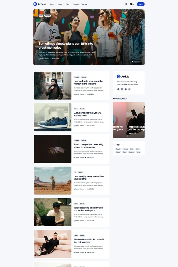
Article is a Ghost theme by Storied Themes, and it is clearly aimed at magazine publishing with a lifestyle-style editorial presentation. The overall design direction leans toward clean cards, large featured images, category labels, and a content-first homepage that pushes readers from featured stories into a longer archive flow.
From a Ghost compatibility standpoint, I would describe it as generally good rather than exceptional. I do not see this as a compatibility-led theme review story anyway. My issue with Article is not that it looks broken. My issue is that it does not offer enough depth or enough polish in the areas that separate a decent Ghost theme from one I would genuinely tell readers to buy.
Who this theme is best for
I only see Article fitting a small slice of Ghost users.
It makes the most sense for:
- Small magazine-style sites that want a tidy homepage with featured content at the top
- Publishers who prefer a familiar editorial layout over a more original visual identity
- Buyers who specifically want list and grid-style card presentation, a sidebar, and basic discovery features without asking much more from the theme
Even then, I think the fit is narrow. If you want your magazine site to feel more distinctive, more premium, more content-rich, or more accessible, I would move on quickly.
Design and user experience
On the surface, Article is clean. The homepage puts featured posts front and center, uses bold imagery, and keeps the browsing path obvious. I can see the logic immediately: highlighted stories at the top, a long feed of content below, clear category labels, and supporting discovery elements around the edges.
The problem for me is that clean does not automatically mean compelling.
Once I spend a little more time with the demo, the layout starts to feel generic. The featured area does its job, but it does not create much personality. The card-based archive is easy to scan, yet it also feels interchangeable with a lot of other lightweight editorial themes. I do not come away thinking this theme gives a publication a strong identity.
Navigation is workable. The demo shows a horizontal menu, dropdown structure, search, sign-in access, tag browsing, and a mobile menu state, so I do think readers can move around the site without friction. Still, I would call it functional rather than memorable.
I also think the design repeats itself more than I would like. Featured posts appear again in supporting areas, tags are surfaced prominently, and related content blocks keep the page active, but the overall experience starts to feel samey. Instead of building momentum as I browse, the theme settles into a predictable rhythm very quickly.
Readability is decent. Typography looks restrained, spacing is clean enough, and post pages are easy to follow. I do not have a major complaint there. My bigger issue is that the theme feels visually safe to the point of being forgettable.
Feature analysis
Article does include a reasonable spread of magazine-friendly features on paper. The homepage featured posts can be shown as a carousel slider or as cards, and the theme also supports list and grid card styles. That matters because magazine sites need flexible browsing patterns, and Article at least gives some control over how content is presented.
It also supports dark mode, which is a useful quality-of-life feature rather than a selling point by itself. I like having it, but I do not think dark mode is enough to elevate a weak overall value proposition.
For navigation, I can verify dropdown menus and a straightforward horizontal menu structure. That is important for magazine sites with multiple sections, and I do think Article handles that part well enough. It gives publishers a clear way to organize categories without making the interface confusing.
The theme also includes a blog sidebar, related posts, tag cloud, and social media sharing. Those are all useful features in the real world because they help readers continue browsing, discover more topics, and share content without leaving the post experience feeling dead-ended. Article gets the basics right here.
There is also a custom error page listed among the available features. I see that as a welcome extra, but not one that changes my overall view. Helpful details are nice, but they do not fix the bigger issue for me, which is that the full package still feels thin for a paid theme with a bad feature-set rating and bad value rating.
That is really where I land on the feature side. Article has enough to avoid feeling empty, but not enough to feel strong. I see a checklist of familiar Ghost theme components, not a standout product.
Performance, SEO, and accessibility
The performance-related picture here is mixed rather than outright poor. A Google Best Practices score of 100 is strong, and a Google SEO score of 92 is also respectable. Those are good numbers, and I do not want to pretend otherwise.
The accessibility story is much weaker.
A Google Accessibility score of 86% tells me there is some room for improvement, but it is not catastrophic on its own. The more worrying number is the Accessibility Checker score of 53%, which is a clear weakness. That is not a small nitpick. That is the kind of result that makes me pause before recommending the theme to anyone who cares about broader usability and publishing responsibly.
For me, that gap matters. A clean-looking magazine theme should not be skating by with such a weak accessibility result. When I already think the value and feature depth are underwhelming, poor accessibility pushes it even further into skip territory.
Pros and cons
What I like
- I think the homepage is clean and easy to understand
- I like that it supports carousel and card-based featured content
- I can verify dark mode, dropdown menus, related posts, tag browsing, and social sharing
- I think the browsing flow is straightforward for a magazine-style site
- Best Practices and SEO scores are solid
What I do not like
- I do not think the design has enough personality
- I find the overall experience too generic for a theme I am supposed to take seriously
- The feature set feels basic rather than competitive
- The value for money is bad
- Accessibility is a real weakness, especially with a 53% Accessibility Checker score
- I do not see enough here to justify recommending it over stronger alternatives
Rating and recommendation
I am giving Article a 2.
That score comes from the full picture. I see a theme that is tidy, usable, and reasonably organized, but also one that feels too ordinary, too limited, and too weak on accessibility to earn my recommendation. The bad value-for-money and bad feature-set assessment matches my own impression.
My recommendation is simple: No, I do not recommend it. Unless you already know this exact design direction is what you want and you are comfortable accepting its shortcomings, I think you should keep looking.
Final thoughts
Article is not a disaster. I want to be fair about that. It is clean, readable, and structurally familiar, and some buyers will like that simplicity.
But I do not review themes just on whether they look fine in a demo.
I review them on whether I would confidently tell readers to spend their money on them. In this case, I would not. Article feels too basic, too replaceable, and too weak where accessibility and value should be stronger. My advice is to skip it and keep looking for a better Ghost magazine theme.