- https://aalto.themex.studio/
- https://tmb.my/aalto-ls
- https://tmb.my/aalto-ls
- https://themex.lemonsqueezy.com/buy/add20d6c-e05a-4e3c-a954-8b093f4b704d/?aff=1jB1m
- https://themex.studio/docs/aalto-docs/
- https://themex.studio/aalto-changelog/
- https://themex.studio/contact/
Aalto Ghost Theme Review for Modern Blogs
I think Aalto tries to do something familiar: offer a polished blog-focused Ghost theme with a modern editorial look and enough built-in layout variety to attract publishers who want more than a plain personal blog.
That said, I would not put it near the top of my shortlist.
From what I see, Aalto may suit a narrow type of blogger who mainly cares about visual presentation and wants a blog theme with a few built-in content browsing features. But for most Ghost users, I think the weaknesses are noticeable enough that I would keep looking.
Quick verdict
I do not recommend Aalto.
My rating for it is 3/5, and that score reflects a theme that is usable in some situations but too compromised to stand out in a crowded Ghost theme market. It has some helpful blog features and a respectable visual structure, but the accessibility side is hard for me to ignore.
Theme overview
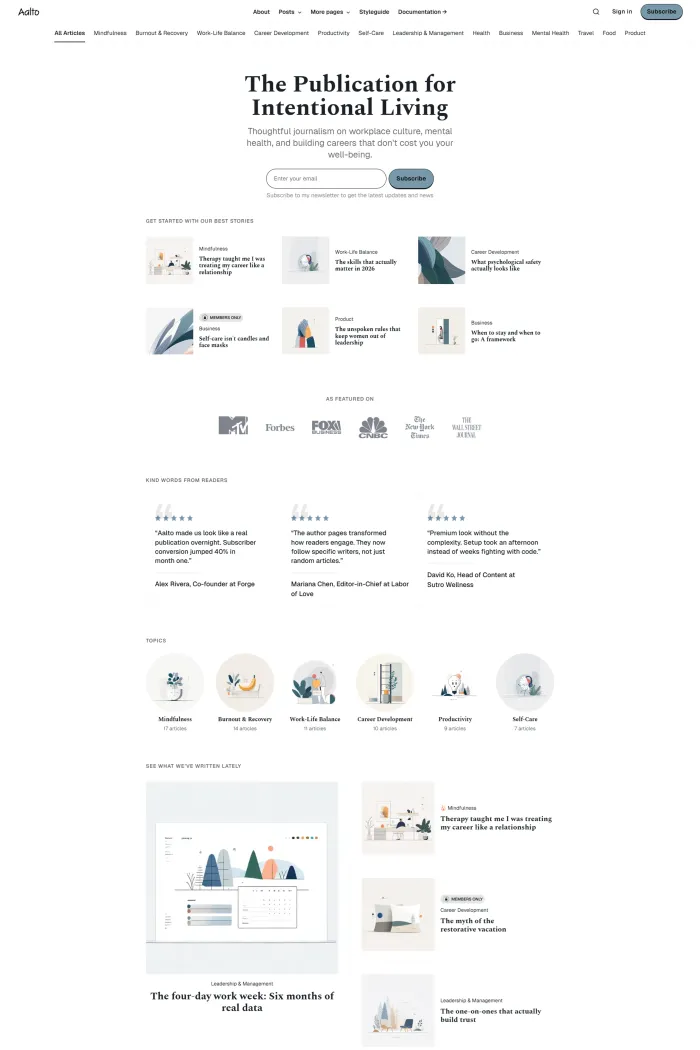
Aalto is a Ghost theme by Themex Studio, and it is clearly aimed at blog publishing.
Its overall design direction feels modern, content-led, and layout-conscious. The theme appears to rely on visual structure more than personality, which can work well for writers who want a clean frame around their articles without turning the site into something overly flashy.
Its Ghost compatibility is listed as Good, which at least suggests it is built with Ghost usage in mind rather than being a generic blog skin forced onto the platform.
Who this theme is best for
I only see Aalto fitting a fairly specific type of buyer.
Bloggers who want a more structured layout
If you run a blog and want more than a basic feed, Aalto does offer a stronger layout toolkit than a minimal one-column theme. The grid layout, multiple layouts, authors archive, related posts, and table of contents all support a more layered reading experience.
Publishers who care more about presentation than accessibility depth
I can see some people choosing Aalto because they like the visual direction and want features like dark mode, dropdown menus, and horizontal navigation built into the theme. For that buyer, Aalto may feel convenient.
Still, I think that is a narrow case. For most people starting a serious content site, I would rather point them toward a theme with fewer question marks.
Design and user experience
Visually, Aalto is fairly competent.
The layout feels organized, and the grid-based presentation helps break up content in a way that can make browsing feel more active than a plain list view. That matters on blog sites where readers need reasons to keep moving beyond a single post.
I also think the navigation choices are practical on paper. A dropdown menu and horizontal menu can work well for blogs that have multiple categories, pages, or archive paths. When a blog grows, that kind of navigation matters more than many buyers expect.
The theme also seems to understand that readers often move through content in layers. Related posts help with onward browsing, and an authors archive can be useful on multi-author sites or blogs that want a slightly more editorial structure.
Where I become less positive is in the overall impression of refinement.
Aalto does not strike me as weak in layout, but it does not feel especially sharp either. I see a theme that covers the basics of modern blog presentation without giving me a strong reason to choose it over stronger alternatives. It looks serviceable, not standout.
On mobile-friendly browsing, the visible structure appears adaptable enough for modern devices, but I am not seeing the kind of polished edge that would make me enthusiastic about it.
Feature analysis
Aalto has a moderate feature set, and I think that is the right way to frame it.
Authors archive
This is useful for blogs with multiple contributors. It gives authors a clearer presence and makes content discovery better on sites where readers may want to follow specific writers.
Custom error page
A custom error page is a small feature, but I still count it as meaningful. It helps keep the experience on-brand and can reduce frustration when readers hit dead ends.
Dark mode
Dark mode is a welcome feature, especially for blogs with long-form reading. It gives readers more flexibility and can improve comfort in low-light use cases.
Dropdown menu and horizontal menu
These are practical navigation tools rather than headline features, but they matter. A blog that starts small can grow messy quickly, and themes that handle navigation more thoughtfully usually age better.
Grid layout and multiple layouts
This is one of the more useful parts of Aalto. Layout flexibility helps a blog present different content types more effectively, and a grid structure can make archives and homepage sections feel more dynamic.
Still, layout variety alone is not enough to make me recommend a theme. It needs to be backed by stronger overall execution.
Related posts
This is one of those features that quietly improves a blog. It can support session depth, reduce bounce risk, and encourage readers to keep exploring.
Table of content
For longer articles, a table of contents is a genuinely helpful feature. It improves scanning, helps readers jump to relevant sections, and gives long-form posts a more organized feel.
Social media sharing
This is a standard convenience feature. It is useful, but not something I would treat as a differentiator in a premium Ghost theme review.
Performance, SEO, and accessibility
This is where my view of Aalto becomes much more cautious.
On the positive side, the supplied scores show 100% for Google Best Practices and 92% for Google SEO. Those are solid signals, and they suggest the theme is not careless in those areas.
The Google Accessibility score is 88%, which tells me there is some effort here, but it still leaves room for improvement.
The bigger issue is the Accessibility Checker score of 47%.
That is not a small dip. That is a clear weakness. When one accessibility measure lands that low, I stop treating accessibility as a minor concern and start seeing it as a meaningful drawback. For a modern Ghost theme, I expect better.
So while Aalto shows some decent technical signals in best practices and SEO, I do not think the accessibility side is strong enough to inspire confidence. For me, that seriously hurts the theme’s overall value.
Pros and cons
Pros
- Clean blog-focused design direction
- Useful built-in features for content browsing
- Grid layout helps structure archive and homepage presentation
- Authors archive adds value for multi-author blogs
- Table of contents is helpful for long-form content
- Dark mode is a welcome reader-facing feature
- Strong Google Best Practices score
- Good Google SEO score
Cons
- I do not think the overall design is distinctive enough to justify choosing it over stronger alternatives
- Accessibility is the biggest problem here
- Accessibility Checker score of 47% is a serious weakness
- Feature set feels moderate rather than compelling
- Value for money sits in the middle, which is not enough when the theme also has clear drawbacks
- The theme feels situational rather than broadly recommendable
Rating and recommendation
I rate Aalto 3/5.
That score reflects a theme that is functional, reasonably structured, and capable of supporting a standard blog. But it also reflects a product that does not give me enough confidence where it matters most.
The official recommendation here is NO, and I agree with that fully. I do not recommend Aalto for most Ghost users.
For me, a theme needs to do more than look organized and offer a handful of useful features. It also needs to show stronger overall quality, and Aalto does not get there.
Final thoughts
I think Aalto is one of those themes that may look acceptable at first glance but becomes less convincing the closer I examine it.
Yes, it has a blog-friendly structure. Yes, it includes features that can help with reading flow and content discovery. But none of that is enough to outweigh the accessibility concerns and the generally average value proposition.
Unless you have a very specific reason to want this exact design direction, I would skip it.
There are better Ghost blog themes out there, and I would strongly suggest keeping your options open before settling for Aalto.