Newsletter Branding in Ghost
For creators and publishers, maintaining brand consistency across all platforms is a constant challenge. The look and feel of a website often diverge from the emails sent to subscribers, creating a disjointed experience.
Ghost's v5.126.0 update directly addresses this long-standing issue by introducing a robust suite of newsletter design settings.
This update represents a significant strategic shift. Previously, customizing a newsletter's appearance required diving into Ghost's core files and editing code. This process was not only technical but also fragile.
Creators often feared that updating their Ghost instance would overwrite their carefully crafted newsletter customizations, forcing them to reapply changes manually after every update.
The new design settings solve this problem by moving customization out and into the Ghost Admin panel. Now, publishers can update their newsletters' look and feel without risking losing them on update. This change fundamentally lowers the technical barrier, empowering creators without coding knowledge to achieve high brand consistency.
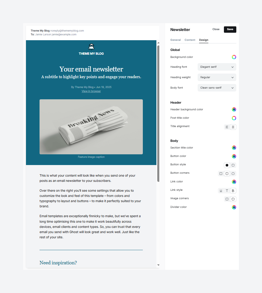
New Design Settings
The new controls are organized logically into three sections within the newsletter settings: Global, Header, and Body.
A. Global Controls
These settings establish your newsletter's core visual identity, acting as the canvas on which your content is painted.
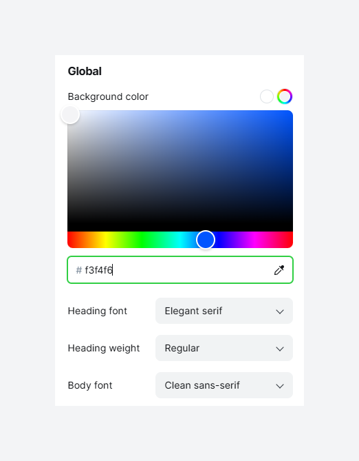
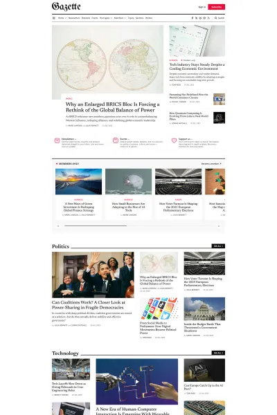
Background Color
This setting controls the background color for the entire email body. While the default is often white, a subtle off-white or a light, brand-aligned color can create a more premium feel and reduce screen glare for readers. Dark backgrounds should be used with caution, as support can vary across different email clients, potentially compromising readability.
Heading Font & Heading Weight
Here, you can select the font family (e.g., serif, sans-serif) and weight (e.g., Normal, Bold) for all headings (H1, H2, H3, etc.). A bold, distinctive heading font can capture attention and set the tone. Pairing a modern sans-serif heading with a classic serif body font is a combination that balances style and readability.
Body Font
This defines the font for all paragraph text. The priority should be legibility for on-screen reading. Sans-serif fonts are generally considered easier to read in long blocks of digital text. The font should also reflect the publication's voice—a serif font can convey a more traditional, authoritative tone, while a sans-serif font feels modern and clean.
B. Header Design
The header is the first visual element a subscriber sees. These settings ensure it makes an immediate, branded impact.
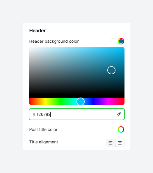
Header Background Color
This option sets a background color specifically for the header area, distinct from the global background. It can be used to create a bold, recognizable entry point for your newsletter. A contrasting header color makes your publication instantly identifiable.
Post Title Color
This controls the color of the main post title. The most important consideration here is accessibility. The title color must have a high contrast ratio against the header background color to be easily readable by everyone, including those with visual impairments.
Title Alignment
This setting aligns the post title to the left or center. This is a subtle but meaningful choice. Left alignment is the standard for most and provides a natural reading flow. Center alignment lends a more formal, declarative feel, suitable for major announcements.
C. Body Styling
These settings provide granular control over the elements that make up the main content of your newsletter.
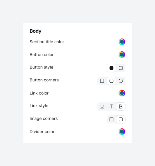
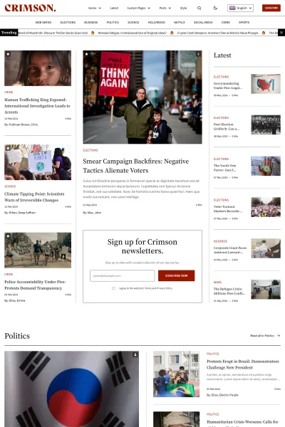
Section Title Color
This sets the color for subheadings within the body of your content. This color should be different from the main body text but harmonious with the overall palette. It helps to break up long articles into digestible chunks, guiding the reader through the content.
Button Color, Button Style, & Button Corners
These three settings work together to define your calls to action. The Button Color should be a high-contrast, "action-oriented" color from your brand palette. The Button Style allows you to choose between a solid fill or an outline, which can be matched to your website's design language. The Button Corners setting controls the corner radius. Sharp corners convey formality and precision, while rounded corners feel more modern, approachable, and friendly.
Link Color & Link Style
This controls the appearance of hyperlinks. For accessibility, it is crucial to use more than just color to indicate a link. The Link Style setting, which adds an underline, or bold, is vital. Relying on color alone excludes readers with color blindness. The link color should still be distinct from the body text to draw the eye.
Image Corners
This setting applies a border radius to all images in your newsletter. It's a small detail that helps create a cohesive aesthetic. If you are using buttons with rounded corners, applying a slight radius to your images can make the entire design feel more integrated and polished.
Divider Color
This sets the color of the horizontal line used to separate content sections. The purpose of a divider is to create a gentle visual separation, not to draw attention to itself.
How to enable these new settings?
This update provides a significant leap forward in branding control for Ghost newsletters, placing powerful design tools directly into the hands of creators without requiring code.
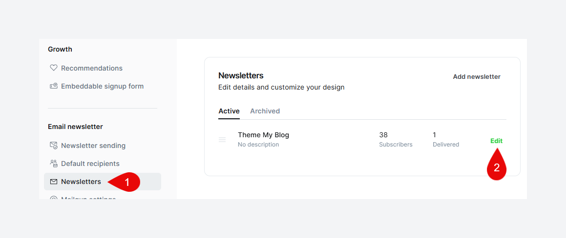
For Ghost(Pro) Users: These features are already live in your account. Navigate to Settings -> Newsletters, edit your newsletter, and open the Design tab to begin.
For Self-Hosted Users: To unlock these new design settings, you must update your Ghost instance to version 5.126.0 or newer.


Start your publishing journey effortlessly with Ghost(Pro), the hassle-free, fully-managed hosting. Click the button below to get started!
-
0% Transaction fees
-
Custom domain
-
Fully managed service
-
Automatic weekly updates
-
Worldwide CDN
-
Enterprise-grade security
-
Threat & uptime management
-
Migration from current CMS
(For Yearly billing) Disclaimer: This CTA may contain affiliate links. We may earn a commission at no cost to you. Not sponsored or endorsed by Ghost.org, the Ghost Foundation, or any third-party developer or agency. Features, pricing subject to change without notice.